Modal
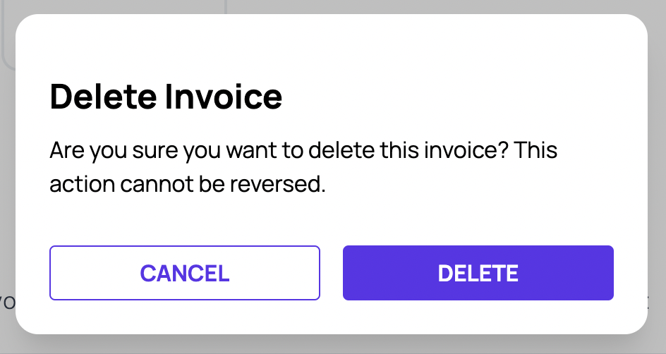
The Modal component is a versatile and reusable component that provides a modal dialog for displaying content in our app. We can customize it by passing various props to suit our component needs. In this guide, we'll walk through how to use the Modal component in codebase.
Importing the Modal Component
To use the Modal component in our app, we need to import it from our styled components. Here's how we can import it:
import { Modal } from "StyledComponents";

Using the Modal Component
The Modal component can be used with various props to control its appearance. Here is an example of how we can use it:
<Modal
  isOpen={true}
  onClose={() => setShowDeleteDialog(false)}
>
  <div className="mb-8 mt-4 flex-col">
    <h6 className="mb-2 text-2xl font-bold">Delete Invoice</h6>
    <p className="mt-2 font-normal">
      Are you sure you want to delete this invoice?
      <b className="font-bold" /> This action cannot be reversed.
    </p>
  </div>
  <div className="flex justify-between">
    <Button
      className="mr-2 w-1/2"
      size="medium"
      style="secondary"
      onClick={}
    >
      CANCEL
    </Button>
    <Button
      className="ml-2 w-1/2"
      size="medium"
      style="primary"
      onClick={}
    >
      DELETE
    </Button>
  </div>
</Modal>

Modal Component Props
| Name | Description | Default Value |
|---|---|---|
| isOpen | To specify whether the Modal is open or not. bool | false |
| onClose | To specify the callback which will be invoked when the Modal is closed. func | (e) => void |
| customStyle | To provide external classNames to the Modal. string | "" |
| children | To specify the content to be rendered inside the Modal component. node | - |