Sidepanel
The Sidepanel component is a versatile and reusable component that provides a side panel interface for displaying content in our app. We can customize it by passing various props to suit our component needs. In this guide, we'll walk through how to use the Sidepanel component in codebase.
Importing the Sidepanel Component
To use the Sidepanel component in our app, we need to import it from our styled components. Here's how we can import it:
import { Sidepanel } from "StyledComponents";
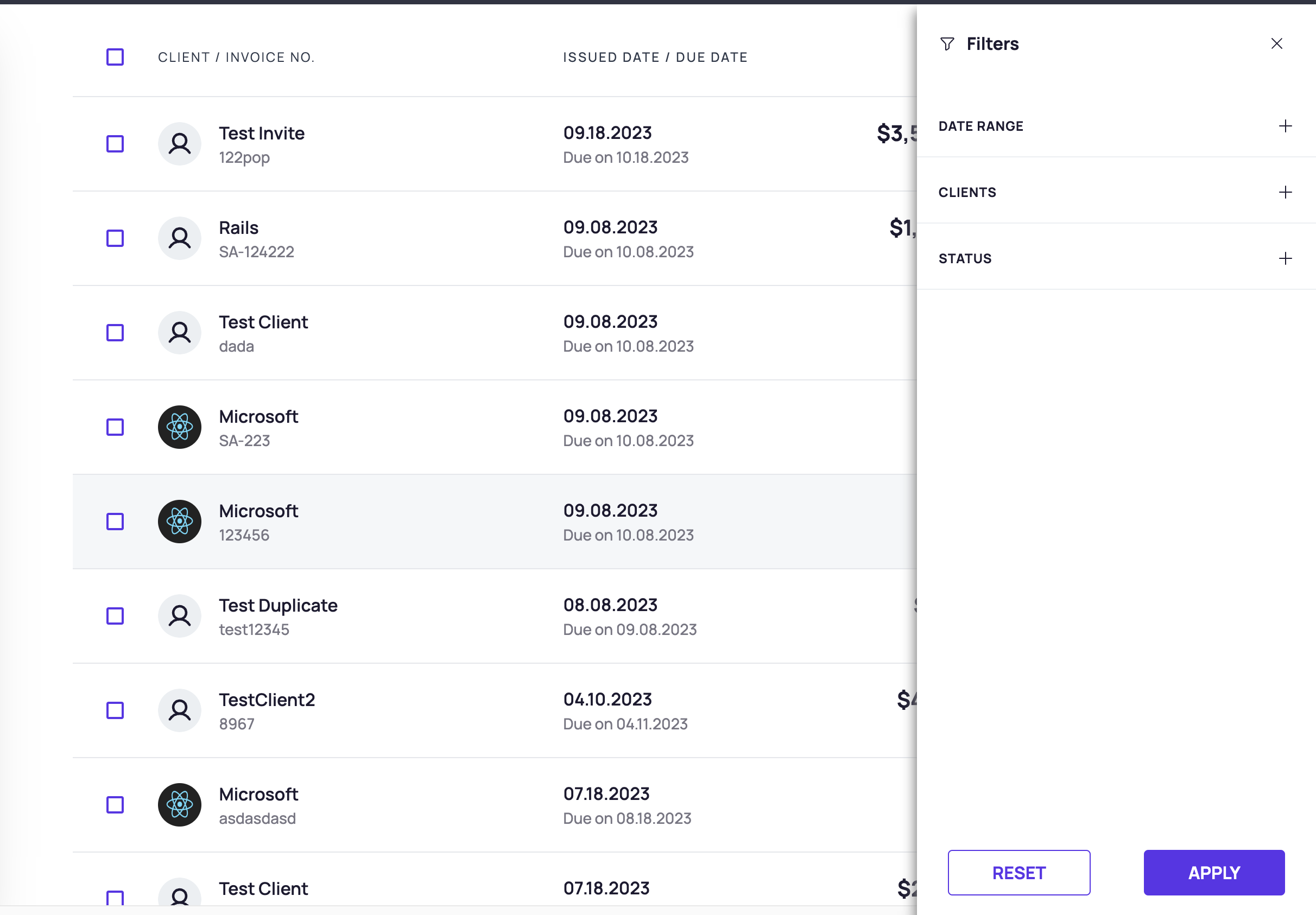
Using the Sidepanel Component
The Sidepanel component can be used with various props to control its appearance. Here is an example of how we can use it:
<SidePanel WrapperClassname="py-8 px-6" setFilterVisibilty={() => ()}>
  <SidePanel.Header className="flex justify-between">
    <div className="flex items-center">
      <ClockIcon className="mr-2" size={16} weight="bold" />
      <span>Filters</span>
    </div>
    <Button
      className="rounded p-2 hover:bg-muted"
      onClick={}
    >
      <XIcon size={16} weight="bold" />
    </Button>
  </SidePanel.Header>
  <SidePanel.Body className="h-full overflow-y-auto py-10">
    {/* component content here */}
  </SidePanel.Body>
  <SidePanel.Footer className="sidebar__footer h-auto justify-around px-2 pt-1">
    {/* component content here */}
  </SidePanel.Footer>
</SidePanel>
Sidepanel Component Props
| Name | Description | Default Value |
|---|---|---|
WrapperClassname | To provide external classname to the Panel component. string | "" |
setFilterVisibilty | To specify the callback for the Panel component should to be closed on outside click. func | - |
children | To specify the content to be rendered inside the Panel component. node func | {} |
disableOutsideClick | To specify whether the Panel component should close on outside click. bool | false |
Sidepanel Header Component Props
| Name | Description | Default Value |
|---|---|---|
classname | To specify className to be applied to the Panel Header container. string | - |
children | To specify the content to be rendered inside the Panel component. node | - |
Sidepanel body Component Props
| Name | Description | Default Value |
|---|---|---|
classname | To specify className to be applied to the Panel Header container. string | - |
children | To specify the content to be rendered inside the Panel component. node | - |
Sidepanel footer Component Props
| Name | Description | Default Value |
|---|---|---|
classname | To specify className to be applied to the Panel Header container. string | - |
children | To specify the content to be rendered inside the Panel component. node | - |