Toastr
The Toastr component is a utility for displaying toast notifications in our application. Toast notifications are a way to provide users with non-intrusive, temporary messages or feedback. In this guide, we'll walk through how to use the Toastr component in codebase.
Importing the Toastr Component
To use the Toastr component in our app, we need to import it from our styled components. Here's how we can import it:
import { Toastr } from "StyledComponents";
Using the Toastr Component
The Toastr component can be used with various props to control its appearance. Here are some examples of how we can use it:
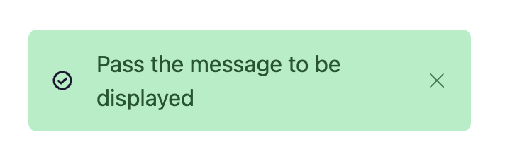
Success message toastr
Toastr.success("Pass the message to be displayed");
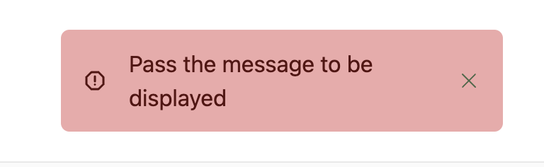
Error message toastr
Toastr.error("Pass the message to be displayed");